Olive - Health and Wellness
The personal health tracking app to keep you on top of your health, connect you to your doctors with ease, and help you develop better habits.
Project Overview
Problem Statement :
Objective :
Health portal users need an easy, secure, and quick way to record their medical information and have access to general physical and mental wellbeing features.
The Olive Health Portal will be a cross-platform, inclusive health and wellbeing portal where users can input their health and medical records as well as view educational resources to help them develop better habits for their overall wellbeing for both mental and physical health.
Outcome :
After conducting research and iterating on designs, Olive provides an all-in-one solution that brings together facets of individual’s health - ranging from their health records, their day-to-day routine, to connecting to their healthcare professionals - into one easy-to-use application that personalizes their experience to help maintain and better their health.
Roles and Responsibilities
UX/UI Designer
UX Researcher
Information Architect Designer
Market Analysis
Tools Utilized
Figma
Google Office Suite
UsabilityHub
Photoshop
Project Details
Genre: Health and Wellness
Client: CareerFoundry
Team Size: 1
Duration: 9 Months (August 2022- April 2023)
Platforms: iOS Mockups
Alright, first and foremost, who are we up against, how are users using these apps, and how can we stand out in the crowd on the app stores?
Now that we know what we’re up against,
What type of people will use our product?
Phase 1 : Research
Who is our competition?
Apple Health
Rountinery
Our competitors would be Apple Fitness, Apple Health, Rountinery, Fitbit, and myChart as they provide either the ability to input data and connect to a healthcare provider to keep medical records, and/or provide resources for health education. The risk is our app will get overshadowed by applications that come with devices, such as Apple Health, that are
pre-installed and free, or by applications that come with their own external hardware integrations for better tracking of quantifiable metrics. However, most of the applications in the market only provide either mental health or physical health functionalities and there are very few applications that provide both, ignoring the overall view of combining multiple factors that contribute to a person’s health.
Therefore, we would be able to take up a large presence in the market.
User Research
In order to understand the needs of our users, I had to first meet with them and ask them what would want and need out of a health tracking app. I conducted interviews with people from a wide range of medical backgrounds and with different physiological needs.
After my interviews, I compiled each response, needs and wants, and what motivates them about the subject into two User Personas to represent our potential users.
I constructed these personas to represent the age brackets our app would be used in and their different needs from an app like ours.
Angela represents the older generation that would like to keep track of their health and communicate with their doctors easily.
Jake represents the side of the application that will be used for starting healthier habits and for the younger population that don’t necessarily need to track their medical records but can utilize the app in other ways.
Alright, I have two primary personas.
Let’s create a User Journey Map to see how they would traverse the application and what issues might arise when using the product
User Flows
*Click on the images above and below to see how the user would go through their task
Now that all my initial research has been completed
Time to move onto creating the designs for the Prototypes.
Phase 2: Prototyping
Site Map
In order to figure out how the site should be laid out that would make the most sense to my users, I conducted a card sort where potential users would sort alike items to see where people would look to find specific functions
Wait, before I make the prototypes, I should probably figure out how the functions should be arranged so that I know how the application should flow.
The Revised Site Map
After reviewing the similarity matrix and other data, I developed this new site map that was much more organized and focused.
The First Site Map
This initial site map was created in the order I had seen other applications create theirs. I had quickly after making it that I had basically put the entirety of the application accessible from the dashboard/navigational areas. This isn’t necessarily a bad thing but there were definitely functionalities that needed to be collapsed into different parts of the application and moved around so that it isn’t all upfront.
Information Architecture and Card Sorting
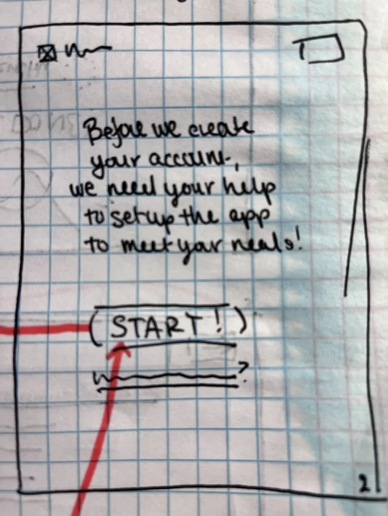
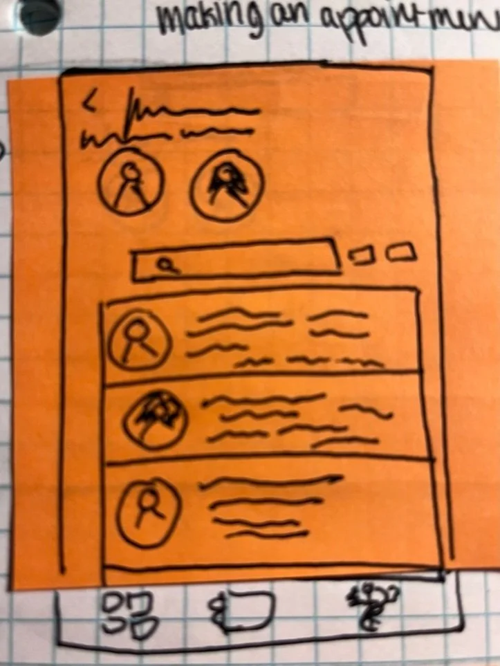
Low Fidelity Mockups
Wireframe Progression
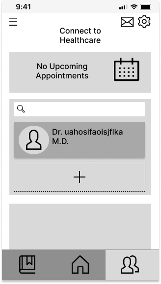
Mid Fidelity
High Fidelity / Final
Throughout the development, I designed and iterated on the screens of Olive, going through multiple stages of fidelity using the feedback given to me by both potential users from testing and peers to refine each iteration until I had designs that were usable for their intended functionality.
Phew, now that’s that figured out.
Let’s do the wireframes and design this app!
Alright, we’ve gone through the iterations for the wireframes,
time to test it out on our potential users!
Phase 3: Usability Testing
3 tasks / 9-12 Questions
5 participants
The script I created was comprised of multiple parts:
Introduction
Personal Demographic Questions
Background Questions
Open Ended Questions
The Usability Tasks
Final Thoughts / Wrap Up
Testing Results
15-20 minutes
You can view the full Testing Script here
After conducting the tests with my 5 participants, I complied their responses into an affinity map, dividing them into 4 sections :
Errors, Negative Feedback, Positive Feedback, and Observations.
All participants found the software fairly easy to use and intuitive which is a great sign!
I received a lot of great constructive criticism about each error and frustration as well which I noted for future iterations.
To view the full results report, click the buttons below
Phase 4: Style Guide and Final Design
Color Palatte
Primary
#92BD91
#007C3E
Secondary
#C4EFD3
#FFFFFF
#FB8B83
Primary
Dark
#333333
Final Designs
#8F8F8F
Background
#D9D9D9
Secondary Darks
Alert
Retrospective and Final Thoughts
As my first ever UX/UI project, I believe I did pretty well to make a functional and user-friendly design for this software.
Throughout the process, I used my knowledge of Game Design and what I learned from Career Foundry to create these designs.
I definitely learned quite a bit from inception to finalized designs, from both the process and my peers.
For me the most challenging parts were the wireframes and the aesthetics, both I’ve never practiced until now and will continue to improve with projects to come.
Personally, I believe there are a large number of areas of improvements that need to be made for Olive to be a useful and functional product. There are missing functionalities everywhere such as the calendar for appointments, the button to favorite entries and articles, the article page itself, a majority of the healthcare functions, etc. The product needs a visual overhaul to be more appealing and softer in terms of feel of the UI to fit with the intended theme of Olive. Although not completely necessary, the entire application also needs an expert in healthcare or deeper research done to make sure the information and processes provided are in-line with actual medical facts so that it can truly help the user and be an assistant to bettering one’s health.
